Coursework
Monday 7th September 2020
Learning Objective:
- to explore possible tasks and research similar products.
Create a front over and a double-page spread article for an informative and entertaining fashion magazine aimed at an audience 14-18 year olds.
 - younger target audience as younger person on cover.
- creative different style, unique.
- different style with the edit of the colours. Less black and white and not too much colour just a pop of colour.
Wednesday 16th September 2020
Research
Learning Objective:
- to research codes and conventions of similar products.
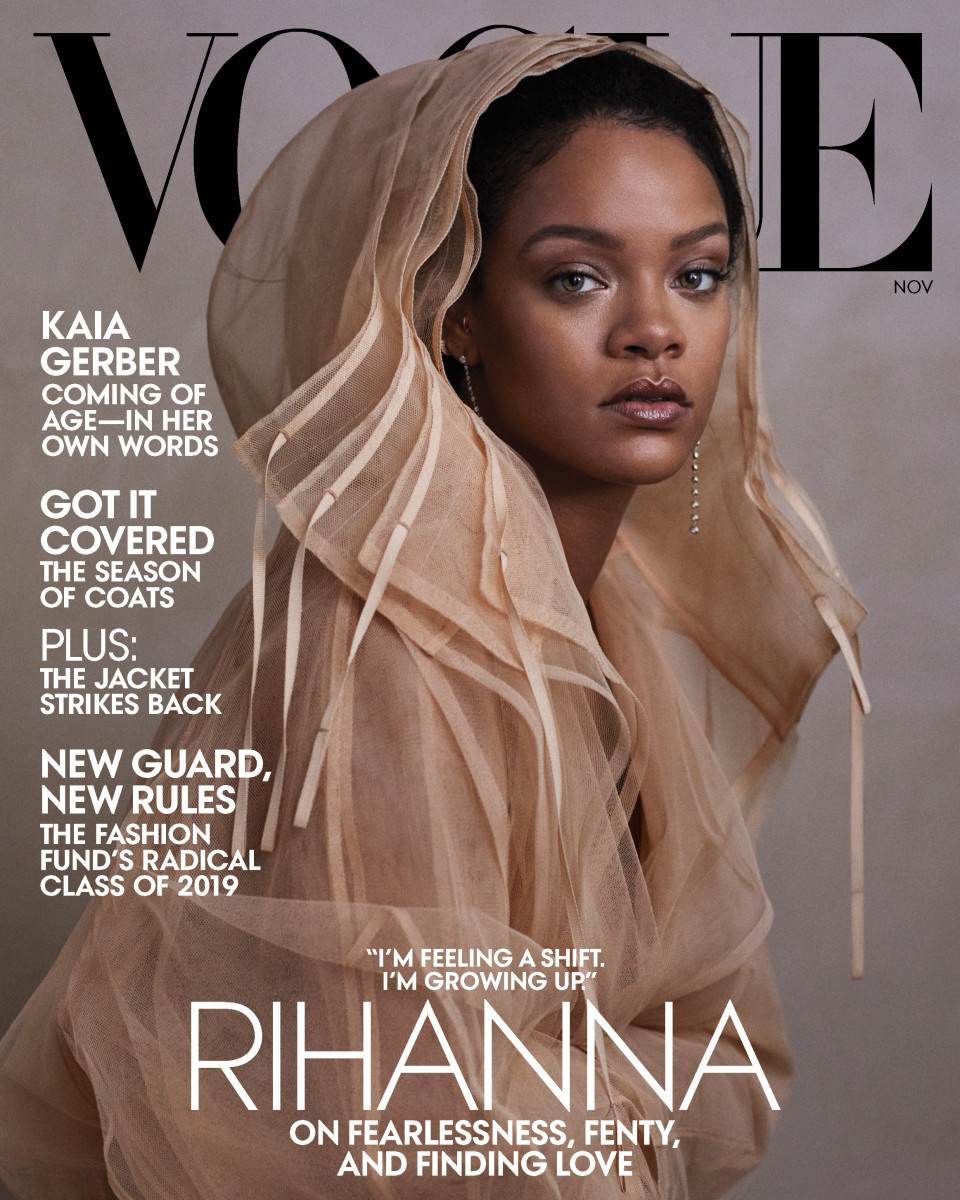
- Mid shot image, mid camera angle. Shows she doesn't need full face close up detail and shows what she is wearing suggesting the style and tone of the magazine with the natural colour usage.
- Neutral colours. Simple but effective makes image stand out. As well as the writing in white makes it very clear and readable.
- Easy on the eye layout, writing does not cover much of the main image.
- 'Vogue' masthead (biggest word) covered by main imagine, showing how Vogue are so well known that they do not need to advertise themselves. As well with Rihanna covering the masthead shows she its the main focus throughout. Simple clear font, very well known.
- Only three main colours (white, black and neutral) keeps it simple clear and calm suggesting the tone of the magazine and what is inside.
- The colours contract each others therefore making the words stand out.
- 'Rihanna' central middle bigger so stands out shows importance. Surrounding quote by Rihanna 'I'm feeling a shift. I'm growing up' links to main image of 'growing up' so more simple, neutral colours. Classic font as links to the 'growing up' quote signifying growing up as well as making it professional, strong and successful.
- Clear main cover line by making it central.
- Black is standing out through the neutral colours making the brand 'Vogue' seem powerful and strong.
- White is mature and simple clear and easy.
- Main image on a plain background with direct address of Rihanna looking directly at the audience, serious face shows her power and direction to audience
- Cover lines on the side shows what will be inside the magazine but on the side out of the way showing its less importance than the main image of 'Rihanna'.
Monday 21st September 2020
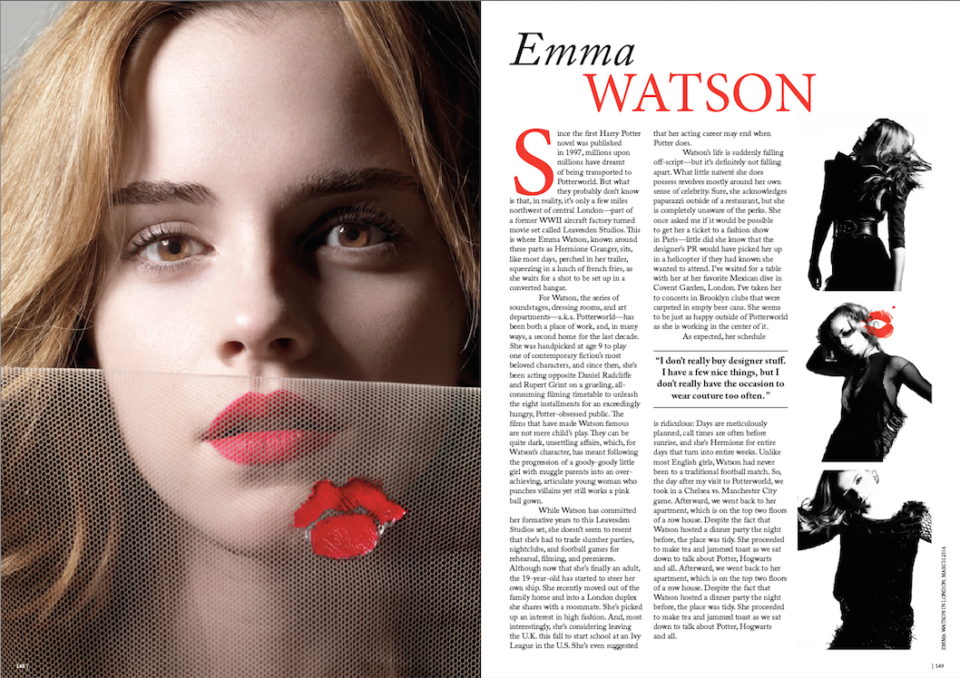
- Masthead - first name in black lower case but last name in red capital letters suggests the mature side and the childish side.
- Colour scheme - black, red and white very classic and simple creates a professional, mature image. The pop of red stands out on the page attracting the reader to the images and writing.
- There is a good balance of images and writing to interest reader who prefer one over the other.
- The red colour links to power and love suggesting the love of power and the publics love for her. So therefore would be interested in reading.
- The font of the writing reflects in the theme of the mature, classic and simple page.
- Page from Vogue so there is a high production value towards the images and writing.
- Image on left is a close up suggesting the close up information we get in the writing on the right.
- The three images of the right all fit well together with a clear black colour theme suggesting a dark with the contract of the white background behind it.
- Image on left of directly looking at the audience showing power and seriousness.
- The page is clear and easy on the eye by not using too much red or too much bright white or dark black.
- Shows her strength and power by not smiling suggesting the fact that women don't need to smile or majorly put themselves out there to become powerful.
- Aimed at age 16-30 because of people known her from Harry Potter.
- Quote on the page in a different font and central to the page making stand out from the rest of the writing.
Wednesday 23rd September 2020
Coursework Planning
Learning Objective:
- to plan an effective product aimed at a specific audience using appropriate codes and conventions.
Initial Planning
- Name - The Zone or Icon
- Tagline - see whats on the inside/ be more than everything
- Sub-genre - Teen Fashion
- Representation - confident
- House Style - Bold modern or half complete
- Colour Palette - green - nature, yellow - happy, blue - serious, red - love
- Cover Image Ideas - medium close up/ medium shot
- Possible Cover Line - bright and bold, style inspiration at only 16, what to wear now, 100 ideas for fall, best. you. ever., your dream career, be yourself, love yourself
- Information - weekly or monthly, 2.99 4.99
- DPS article subject - women being able to wear what they want and feel confident in. how it is hard being a women in fashion and it is hard not to always get judged or criticised. How women get told what to do and what to wear by men.
- DPS images -
Wednesday 30th September 2020
Initial Planning Continued


Target Audience
Learning Objective:
- to research our target audience to enable successful targeting.
Age - 14-18.
Gender - both, mainly female.
Race - all.
Family - supportive family
Education - still n school, maybe going to uni.
Hobbies and Interests - arty, creative.
Think of School - enjoys the lesson they like the most, don't care about others irrelevant to their life.
Urban or rural - both.
Favourite Subjects - art, creative lessons.
Important to them - making to most of live, having fun and doing what they enjoy. Standing out and being different in their style as well as following trends but not basic ones.
Socialise - with their friends
How would friends describe them - fun, creative, arty, chill.
Feel about fashion/environment - love different fashion but still trendy fashion.
EXPLORERS AND REFORMERS.
'Why the future is ours to mould'
Monday 5th October 2020
DIRT
6 = Layout of DPS Wednesday 7th October 2020 Lesson 7
 Wednesday 14th October 2020 Photoshoot Planning Learning Objective: - to create content that meets the set brief by creating meaning for an audience of 14-18 year olds.   Monday 19th October 2020  Statement of Intent Learning Objective: - to produce a concise and clear statement.      23rd November 2020 Mock DIRT Question 1 - OFCOM (Radio Regulator) Question 2 - 'If I Were A Boy' - Beyonce and 'Uptown Funk' - Bruno Mars. Use media language (not audience):
Explain how they different and give an example. The music videos show many media language differences. Camera work and editing is used to make music videos different by use of different camera angles. Camera angles in music videos can create different mood to the videos making them different in style and mood. So in the music videos I have studied 'If I Were A Boy' and 'Uptown Funk' they differ much in camera angles. In 'If I Were A Boy' throughout the camera angle is at an normal angle suggesting the mood of the video which is very serious and professional. Where as in 'Uptown Funk' the camera angle is often slanted which shows how fun and chill the video is showing the mood. Overall camera angle can make a difference to the mood of the music video. Question 3 -
Radio producers target different audiences through the content of their radio programming, local stations are only available on FM in the local areas although some can be accessed through am online presence. Local radio target a specific audience through their coverage of local events, weather and advertising local business opportunities. Radio producers targets a particular audiences through their use of style and genre of a radio programme. This can be seen in the Radio 1 Live Lounge which uses an acoustic style to attract their audience along with a young presenter to attract a younger audience. This can be seen in the Harry Styles performance where he appeared and performed a current hit to attract a younger audience then he covered an older track by Fleetwood Mac which would appeal to an older wider audience especially in his acoustic style. Question 4 -
The cover of Mojo Magazine shows an image of Ray Davies. The colour scheme is monochrome which makes it very serious and connotes old as pictures used to be in black and white. This may suggest how old he is now and is no longer a bright rock youth. The colour scheme also gives the cover a serious and classic theme also suggesting his older age. Question 5 -
Wednesday 25th November 2020 Mock DIRT - Lego Movie Question 6 - BBFC (age rates films in the UK), Games Rating Authority or The Video Standards Council (age rates video game in the UK). Question 7 -
Question 8 -
Uses and Gratification:
Blumler and Katz stated that media products were there for the audience's entertainment, they were for pleasure and to escape the real world. This can be applied to The Lego Movie as it provides humour and escapism into a different world for children. ...(pleasure, humour, escapism, provides a different world). We can see this in the character/setting of Emmet who is funny and breaks conventions and can inspire children. They do this through his portrayal in the film were he goes from being a normal guy to a hero, this can have an influence on children. As well his humour and how he is very in his own imaginary world provides the escapism for children. Children can also relate to him in how he loves living in the Lego world and children can relate to this through their love of Lego. ...(Emmet-funny, breaks conventions, he lives in a Lego world that he loves). Blumler and Katz stated that personal identity is there for audiences to relate to the characters in the film and seen them as role models. This can be applied to The Lego Movie as the characters in the film provide this relation with audiences. We can see this through the character of Wyldstyle who isn't a very stereotypical female character and goes against female stereotypes a lot this can inspire young children. The film provides a non stereotypical female to tell young girls they do not have to follow stereotypes and can be whoever they want. So when young girls watch the film they can see girls can be 'cool' and good at everything going against a stereotype. Girls see this as a role model through this representation of character which children can personally identify with. Question 9 - How did the promotional campaign target a family audience?
Wednesday 2nd December 2020   My Target:
                Wednesday 19th May 2021 Final Coursework   |

30/9/20
ReplyDeleteExcellent notes.
Target: 6 for DPS
2/12/2020
ReplyDeleteTarget: 1 and 2- process of production images at different stages.